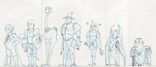
In 2006 I set about to make a cast of characters for a story about morals and values. Each character, with the exception of the fellow in the long coat and tall hat, was named after a specific value and that character would exemplify it through words and actions.
Here also the task was to create a Cast and to show how the characters related to each other in a set. Up to this point I had largely focused on the single character, but had never had them line up. Often this development can lead to major changes if they don't work well together.
The pieces were drawn on several pieces of 8.5x11 inch paper and taped together. The tallest toon being about 10 inches or so, the work appears rough and stiff.
The Cast
In this image, was my first foray into using digital to color a piece. It was scanned into Illustrator and kept simple. Were I to do this one again, I would make sure the lineweight was more varied, but we all have to start at the beginning.
I never wrote the story. The lessons learned were enough for me to continue on with other project ideas. Perhaps, that's not the best way to do things. Finishing work, even poor work is better than not seeing it through, at least at the beginning of an artist's journey.
There will be time later to polish the art. The important thing is to just do the best you can.
As I had been working on 3D training at the same time as my 2D work, it was also a period I began doing concept drawing for the purposes of 3D modelling. So the idea is to draw a front and side view of a character that lines up along specific points, such as the eyes, nose, chin chest and so on. This one is not successful, but in my blog posting, I am showing the unsuccessful work along with the better stuff.
Heads are always the first thing that the viewer will focus on. So I do a lot of them. Will the viewer be able to respond to the character? Will it seem plausible and identifiable? Will the expressions of the toon, come out in the body language?
And characters need other devices to help with that identity...Here a picture WW2 spitfire got a warp/morph/cut and paste treatment in Photoshop, printed onto a new sheet and then redrawn using tracing paper. The character doesn't stop at the edge of the paper...one must also think of the world they live in and adjust accordingly....a good example of this is the animated film Planet 51 .
Other examples that were adjusted in Photoshop for easier viewing...forgive the poor scans please....
Chris


No comments:
Post a Comment