Tuesday, October 2, 2012

2009

2009 was more about consistency.

      At this point I'm working toward having a finished piece of work. On every piece of art I do, I work up many sketches or parts of a sketch. I'll generally focus on the head first, then go to torso, leaving the arms and head for last. However, when the final art is being worked on...the torso needs to come first as that dictates how the pose will work in dynamic.

     Also it gives a clear understanding as how the figure will be placed on the canvas allowing for enough room all around. In digital format though, it's a moot point as we can add canvas to any side of the work that needs more room.

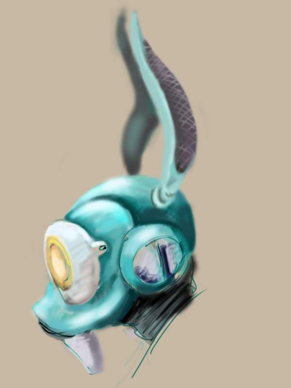
First up is the Goblin Gunner.
Goblin Gunner
   What started out as a dwarf piece ended up in a completely different direction. All of the clothing and props were referenced, thrown into a mixing bowl and then splashed down on the screen...OK it doesn't really work like that, but I can't emphasize reference enough. Artists generally don't work in a vacuum. That means they usually don't just expect to put something down and expect it to be exactly what they see in their minds eye...I say usually, however I will show a successful method that allows pure creativity.


In every single case here, I used a wash method to find my figure.

 I'll explain the technique.

I'm using marker paper which has a resistance to alcohol. Scribbling blue color pencil on the sheet until I had a nice coverage, I then wiped it all of with a gauze dipped in denatured alcohol. Once dry, I flipped it 180 degrees and repeated the process. And then did the same again.

By this third wash, I begin to see abstract shapes within the wash and the lines that are left behind and work blue pencil over those shapes to pull them out a bit more. If it requires another was (partial or full page) so be it....we are on pure creative mode...no thumbnails, no pre-sketches, no reference.

We don't know where we will end up, but we know we will arrive eventually.

Once found, you can render in the shapes, first with blue, then with your chosen pencil...or even better a black Faber-Castell Polychromos.

Yes you want to be accurate, but that's not the initial point here...the point is to be loose with the design...not forced, but forgiving....If the design is not fully realized after a few passes, just hang it on the wall and live with it for a week or more and work on another one.

The swat team shown in the 2010 update was on my wall for two weeks before I was satisfied with the result.

After you have the toon, then you can spend more time making things accurate to reference,,,,there's nothing in the book that says that reference has to come first. It does however, have to be looked at at some point during the creation.

Demon Girl

 This Demon Girl was an exercise is using shape to describe form. In this case, the anatomy, which while I agree is not great, still has enough information to describe the idea. Largely an experiment, working with digital abstract shapes proved not to be a good method for me, but would translate well in the traditional mediums later.


General Saga


General Saga is a portrait done for the Dominance War 4 mini comp. Here, still at this time not in my element medium wise, I am attempting to get a painterly finish as opposed to a more graphic one. 


Erfworld Summer Update 22

Rob Balder's Erfworld is a fantastic online web comic. He had a series of summer updates with guest artists. I was honored to have done this one for him. It basically showed Parson, the lead character talking on a device that I felt was something like a two way kindle. 


   Also that year, I contributed work to the online magazine "Fight On!". It is a magazine for tabletop rpg players of the old school and offers some great articles. With the passing of Dragon Magazine, this is the closest you're going to get to having something to look at.


   In a new approach to design work, I modeled the sword in 3D and then took a shot of it for Photoshop. With the base layer being a great and accurate guide, I didn't worry about perspective as it was already figured. There is also an obvious Games Workshop Necron influence which contributes to the color as well.


Before we get to the final part of this post, i want to show you what are typically my sketchbook pages. Done in ballpoint to resist the fading that can happen with pencils, these images describe quantity of quality. The more you do, the better (and faster) you will get. If something really speaks to you, break out a sheet of basic drawing paper (a 9x12 pad sells for $3.99 at Walmart) and go to town...:)

Sketches for the Interlock motorcycle....


...And the 3D model, which will eventually find it's way into the Unreal Development Kit once I figure out the scripting...:)

Last, a sketch for a comic book cover idea.

 Which was completed at the stroke of midnight on January 1, 2010. It's part of a theory I heard many years ago that states that whatever you are doing at the passing of one year into the next will be a reflection of what the year will bring...so if you are sleeping, you'll be sleeping your life away...I chose to try to have a finished brushstroke in those final minutes......and in the 2010 update, we'll see if it was at all successful...

Chris

Monday, October 1, 2012

2008


Ice Elemental

2008 saw more development in the full figure concept development. Here are two designs for the Dominance War 3 online contest. The first fully realized as a warrior representing the Threedy community. It was all digital and took about 40 hours to complete. The second one here was more about being a quick concept painting, spending about 15-30 minutes on it and going in a different direction. Generally you want to avoid limiting yourself to one idea (even if it's a great one) and have a back up piece in case the client doesn't see the same vision as you...

It also helps (especially if you are working digitally) to just throw down some shapes and get some color on the screen. This is not about making the perfect piece (no art really is), it's about getting the ideas down on paper as fast and as numerous as you can. Later on, you can pick a few of the better ones and render them out a bit more refined. Digital color is much faster than traditional color and can be adjusted with a few mouse clicks. With that in mind, a digital piece is not necessarily a better one than that done with traditional materials.
Robotic Rabbit


Next is the Cyborg Gorilla, also done for a Threedy comp. I envisioned a 'Planet of the Apes' character born out of a lab....and wouldn't you know..years later the movie "Rise of the Planet of the Apes" had a similar undertone. One day I will do a full blown color piece with environment. By the way, in his left hand he holds a human girl doll.
Cyborg Gorilla

Sasha was an idea for a female role in Team Fortress 2. The game has a very illustrative style patterned after the great artists of the early 20th century. People like Wyeth and Pyle set the broad expressive strokes in play and define a world that is unique. I imagined her being the Heavy Weapon  Guy's girlfriend, equipped with dual sub-machine guns and being very acrobatic.
Sasha

The color portrait is quite rough, but once again it was done in about 10-15 minutes just to get some color down.


Bunny G is a character from my sketchbook. The method here is to be able to produce a consistent recognizable character with minimalistic lines. These were done in ballpoint pen. I suspect that it will develop into a comic strip once I get enough written material together. I suppose the design could also do with some refinement. There's absolutely nothing wrong with going back and reworking a piece after it's had a few years to 'breathe', but if you are going to do that, make sure it maintains something of the original idea so that your viewer won't reject it out of hand for being 'unrecognizable'.
Bunny G


Friday, September 21, 2012

2007

   2007 was largely the year I put more color into my work. Working in both digital and traditional methods, the base drawings were things done in ballpoint pen scattered through my sketchbooks.

Pug body studies

   There were several 3D forum contests running that year. My 3D stuff wasn't that strong, but I would typically contribute a concept piece for what I had in mind. In these earlier days, it was more important to get the idea out. You work with a new method long enough the execution will improve, but it takes a lot of effort.


   The dwarf Mulch was another exercise in concept for a 3D toon. In this case, the work was done in colored pencil. I found it to be quite controllable of a medium. The object was to show a character through three different periods of their life. I chose to do a pirate themed dwarf who starts off as a burly sailor, then later becomes an officer and finally a pirate captain. 

 They are about 6-7 inches tall. This also touches on a character that needs to look like it's the same toon, whether it's young or old. Generally you want to focus on a couple of keypoints in the design and carry that through.

2006

   In 2006 I set about to make a cast of characters for a story about morals and values. Each character, with the exception of the fellow in the long coat and tall hat, was named after a specific value and that character would exemplify it through words and actions. 

Here also the task was to create a Cast and to show how the characters related to each other in a set. Up to this point I had largely focused on the single character, but had never had them line up. Often this development can lead to major changes if they don't work well together.


    The pieces were drawn on several pieces of 8.5x11 inch paper and taped together. The tallest toon being about 10 inches or so, the work appears rough and stiff.
                                                                    The Cast
                                                   
     In this image, was my first foray into using digital to color a piece. It was scanned into Illustrator and kept simple. Were I to do this one again, I would make sure the lineweight was more varied, but we all have to start at the beginning.

   I never wrote the story. The lessons learned were enough for me to continue on with other project ideas. Perhaps, that's not the best way to do things. Finishing work, even poor work is better than not seeing it through, at least at the beginning of an artist's journey.

There will be time later to polish the art. The important thing is to just do the best you can.

  As I had been working on 3D training at the same time as my 2D work, it was also a period I began doing concept drawing for the purposes of 3D modelling. So the idea is to draw a front and side view of a character that lines up along specific points, such as the eyes, nose, chin chest and so on. This one is not successful, but in my blog posting, I am showing the unsuccessful work along with the better stuff.


Heads are always the first thing that the viewer will focus on. So I do a lot of them. Will the viewer be able to respond to the character? Will it seem plausible and identifiable? Will the expressions of the toon, come out in the body language?
  And characters need other devices to help with that identity...Here a picture WW2 spitfire got a warp/morph/cut and paste  treatment in Photoshop, printed onto a new sheet and then redrawn using tracing paper. The character doesn't stop at the edge of the paper...one must also think of the world they live in and adjust accordingly....a good example of this is the animated film Planet 51 .


Other examples that were adjusted in Photoshop for easier viewing...forgive the poor scans please....

Chris
Enhanced by Zemanta

Thursday, September 20, 2012

2004-2005

  Not every year is a successful one.

  I think that it's important to talk about those times when life's requirements get in the way of creating Art.

  Before that discussion though, I'll post the few pieces I could find from these years.

                                                              The Rabbit Gladiator

     This character was drawn to about 14 inches tall. Quite large for me as I had for many years created work that was only about 4-8 inches tall. Working large, however, forces one to think a great deal more on spacial and line quality. Like most of my work though, this is slightly negated by the non-photo blue pencil.

Using soft color colored pencils allows one to stay loose with the sketch so that when the heavier linework comes, you can chase the shape, without sacrificing time to 'get it right'.

During the period of 2004-2005 I switched from pencil to ballpoint pen in my sketchbooks. The pen is unforgiving as it doesn't allow erasing. It takes me about 8 months on average to fill up a 6x6 sketchbook, drawing 1-3 inch roughs. This however is excellent training for learning to draw loose.

Even now in 2012, I don't erase the sketch layer and generally find myself less likely to erase a finished line. That's the difference between something that is raw and exciting vs. stiff and boring.

After you have filled a few sketchbooks. you'll also be faster...a trait that can only help getting finished work completed within the deadline.


  Also found were the original pencils from the Tatyana and Zink digitally painted work that was completed in  2012. here is an example of how a good idea can take a while to reach fruition. While I am prone to tossing out old sketchbooks and work that no longer satisfies, these stayed with me.

One thing on that tossing bit is that I feel strongly about the need to let things go to the wastebin, when we have either technically or mentally surpassed the work. I'm no hoarder and the weight of carrying a lot of paper can get a bit daunting. Also, as a commercial artist you will be expected to give up the child when the deadline is due. Best to start getting into that idea early on. Let it go and then let the world decide where the art fits in the grand scheme of things.

Chris

Monday, September 17, 2012

2003

    Working up to the Snoggle piece, I set about to create seven characters as a group. Their names would all start with the prefix "Sn". They were supposed to be a ragtag group of warriors out on the fringes of the explored world. They would never be in any battles as they had perfected how not to 'become involved in such nonsense', but never-the-less, the group would always be a laugh.


  Snoggle would begin like all the others, an idea and a head to go with it. The side torso sketch I did came in 20 minutes while talking on the phone. Let it not be said that the sub-conscience wanderings of the mind are invaluable to the artist! Little has changed on this character since that day. Whatever side I draw the head and feel most comfortable with, is traditionally the side I will first draw the body. Dynamic poses come much later. First, we must train our hand to draw what our mind sees.


  Snuggle, was supposed to be the female role model in the group. From her softer features to her Valkyrie helm, she exemplifies courage, honor and beauty. Mind you, these sketches were done a long time ago and I know they are quite raw, but it helps to have at least some story in order to be more successful at designing a toon.


 General Snokkum is a retired military tactician. He would be the guy who always assumes that he's the leader, but as the characters do their own thing, he really doesn't lead very much. In fact, he's more likely to spend his days talking about great campaigns of the past than actually doing anything useful.


Snout was the pompous and arrogant noble essentially 'slumming' it. He is always trying to impress Snuggle with his pedigree, but to no avail. He has the best armor, weapons, tent and gear, but he also will have another character to keep everything neat, clean and orderly.


  I don't think I ever gave this fellow a name, but I know he was a hothead and always ready to charge head first into trouble. He also had a crush on Snuey, who comes next.


 I saw Snuey as a girl who was trendy to the point of being impractical...I mean who wears fishnets and mini skirts out into the jungle? For her, anything short of 'fun' would be lame.


  One thing that was always evident was that the group never had enough to eat, but their Chef Snowball, was always happy and full.

 I've written several pages of storyline on these guys, but what happens when the idea's don't come anymore? They call this writer's block. I think that choosing if you are going to be an artist, means giving up time to developing any detailed story. An artist should be able to describe in a few sentences what his idea is about, but beyond that...you can leave the writing to those who chose that path and spend more time at the drawing table. It takes a certain creative force to be able to handle both tasks without sacrificing the quality in either.

Chris