I've been designing the main supporting cartoon rabbit in this film...now on indiegogo.....
https://www.youtube.com/watch?v=PwT3x8u83js
https://www.indiegogo.com/projects/patches-me#/story
Sunday, September 13, 2015
Saturday, January 10, 2015

Monday, September 15, 2014


Thursday, April 17, 2014


Thursday, April 10, 2014

Wednesday, September 11, 2013

Wednesday, September 4, 2013

Friday, August 30, 2013
An Early Resolution

Friday, August 23, 2013

Sunday, August 18, 2013

Thursday, August 15, 2013

Thursday, May 23, 2013

Tuesday, May 14, 2013

Monday, May 13, 2013


Friday, May 10, 2013


Saturday, January 19, 2013

Friday, October 5, 2012
Birthday Card
I just returned from a trip to Phoenix last week and during that trip I was asked to do an image for a neighbor's birthday card.

I know that lens flares are a big no-no in the grand scheme of things, but they suited their purpose for this shot.

I know that lens flares are a big no-no in the grand scheme of things, but they suited their purpose for this shot.
2012
2012...Which brings this blog to this year.
I finished my work on the Master's and while I didn't get the final result I was working toward, the time in school gave me a good body of work to continue to build on and more importantly set a precedent for finishing work out.
Are we as artist's ever really done searching for the truth in a piece though? I don't think so. Revisions, sequels and sketchbooks are all part of the process for working through an idea, even if that idea is completed.

With these flour sacks done in Dr. Martin's Hydrus Watercolors , this work shows the many possibilities that could be used to give more character to a flour sack. A search of the web will show what other artists have done.
 A 3D model test with realistic lighting and textures really doesn't set off what should be a cartoon character. Another batch of test (and a new model) will be required.
As for the Demon Girl, she went on to be finished in digital paint at a size of 22x29. In the future, though, I'll make sure that a final work fits into an off the shelf frame.
Done in Painter this time, the characters here were a long time in getting to color. Sometimes an idea needs years to grow....that's just the nature of the job. Just make sure it's you're own idea you're allowing to simmer and not a clients...they wouldn't like that...:)

Not everything is going to work out that well. This was an experiment in a 3D/2D mix. The stage was 3D, lit with a mixture of 3D light and 2D effect...the trim was vector and the driver of course 2D painted.

More practice with watercolor and color pencil. I prefer this method for graphic/comic book work.

 Softened wax-based color pencil with Grumtine I believe.


Other blue pencil sketchwork for painting ideas that haven't seen the light of day yet.


The first thing I tackled out of school was a animation rig for 3DS Max. It ran about 170 hours in work and is currently under a vast revision for the Beta release. The character was provided by The 11 Second Club, an online community of professional an amatuer animators.
Chris
I finished my work on the Master's and while I didn't get the final result I was working toward, the time in school gave me a good body of work to continue to build on and more importantly set a precedent for finishing work out.
Are we as artist's ever really done searching for the truth in a piece though? I don't think so. Revisions, sequels and sketchbooks are all part of the process for working through an idea, even if that idea is completed.

With these flour sacks done in Dr. Martin's Hydrus Watercolors , this work shows the many possibilities that could be used to give more character to a flour sack. A search of the web will show what other artists have done.

 |
| Demon Girl and Pet |
 |
| Tatyana and Zink |

Not everything is going to work out that well. This was an experiment in a 3D/2D mix. The stage was 3D, lit with a mixture of 3D light and 2D effect...the trim was vector and the driver of course 2D painted.

More practice with watercolor and color pencil. I prefer this method for graphic/comic book work.


Other blue pencil sketchwork for painting ideas that haven't seen the light of day yet.


The first thing I tackled out of school was a animation rig for 3DS Max. It ran about 170 hours in work and is currently under a vast revision for the Beta release. The character was provided by The 11 Second Club, an online community of professional an amatuer animators.
Chris
Thursday, October 4, 2012
2011
2011 continued with some turmoil, but kept things in check when I was in the studio working. School was the place to be....
And Snoggle got a revamp


.png)
And further refined in Adobe Illustrator with vector weighted lines..which is a great toolset by-the-way.


The school was also using a program called Animation Master. It uses spline/patch modeling to create the objects. Not my first choice for animation work, but it was an interesting trial, working out the rabbit's head.


The Demon girl with Pet started out as my usual blue pencil wash and was refined with the previously described technique. Then a layer of tracing paper was put down to work through the folds of the dress. It was all based on goth clothing from reference. We'll see the finish in the 2012 update.


Some of the exercises I do is to sketch animated flour sacks....this is really an old Disney trick as the saying goes "If you can animate a flour sack, you can animate anything.". I've probably done a few hundred of these guys in various approaches, but felt they need more personality, hence the props. There's also an orthographic for a 3D model I was working on. The color ones in this case are color pencil.


And Snoggle got a revamp

Working a different set of proportions, I thought Snoggle would work better from an animating standpoint, if his legs were longer. This meant lengthening the rest of his body as well. His shield was shrunk to the size of a buckler and his mismatched armor carried into this version as well. That's an example of what I was saying before with making a revision, and having the characteristics keep the toon's continuity.


Comparison

I also researched cosmonauts and astronauts uniforms. I then fitted Snoggle into a blending of the two in the pose that he had been known for. Of course in this case, he would be holding a flag, not a spear.
.png)
And further refined in Adobe Illustrator with vector weighted lines..which is a great toolset by-the-way.


The school was also using a program called Animation Master. It uses spline/patch modeling to create the objects. Not my first choice for animation work, but it was an interesting trial, working out the rabbit's head.


The Demon girl with Pet started out as my usual blue pencil wash and was refined with the previously described technique. Then a layer of tracing paper was put down to work through the folds of the dress. It was all based on goth clothing from reference. We'll see the finish in the 2012 update.
 |
| The Flyer |
The Flyer combined color pencil wash with color pencil dry and some Photoshop cleanup. While not entirely successful, it's a good example of finding the form within the mass, such as the mechanical bits in the center of the vehicle.

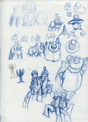
Took a little break from characters and worked on some vehicles. This one, based on the lead character's car in the film Mad Max Roadwarrior, has been 'toonized'. It's kind of like ordering a supersized meal at the local fast food joint. Certain elements are enlarged (in this case the tires and rims) and the rest is squashed/stretched, or enlarged/shrunken depending on the look you are going for.

Sketched with a Marvy Calligraphy Pen . These pens are excellent for sketching because they offer a broad and chiseled tip which allows for quick transition between thick and thin lines as well as fills. It also works well with the angled line/smooth corner style of drawing that I am showing here and went on to work with...such as in these pieces....


^ Just a showing of stylistic approach here, nothing more than that.
The next piece is a 3D work named Greeble. The tris count (or number of triangles allowed to build the model) was quite low. The idea was to create a Knight who wore a mechanical backpack. Attached to the sides of the pack were two arms, one holding a sword, the other a shield.

Unfortunately the count was too low to pull this off without sacrificing important shapes, so I was forced to refine it to this final version.

I was quite happy with the end result and worked in a rig for a walking test. You can read the description on the presentation sheet for more detail.

Some of the exercises I do is to sketch animated flour sacks....this is really an old Disney trick as the saying goes "If you can animate a flour sack, you can animate anything.". I've probably done a few hundred of these guys in various approaches, but felt they need more personality, hence the props. There's also an orthographic for a 3D model I was working on. The color ones in this case are color pencil.


My development work is continuous and never-ending. An artist needs to carry a sketchbook whereever they go and draw everyday if they can. Even 15-20 minutes a day (not unlike physical exercise...which is also vital) will keep things sharp and lessen the amount of time required for 'warming up' before getting into the work at hand.
The difference in the life of an artist as opposed to non artists, is that we are driven not from the point of money, but from an innate desire to create. Yes we all have bills to pay and certainly want our art to take care of that, but at the end of the day, you'll know that the worlds you are building or have built, can be enjoyed by everyone....I don't think any other field offers that outcome.
Keep tooning!
Chris
Subscribe to:
Posts (Atom)