Friday, September 21, 2012

2007

   2007 was largely the year I put more color into my work. Working in both digital and traditional methods, the base drawings were things done in ballpoint pen scattered through my sketchbooks.

Pug body studies

   There were several 3D forum contests running that year. My 3D stuff wasn't that strong, but I would typically contribute a concept piece for what I had in mind. In these earlier days, it was more important to get the idea out. You work with a new method long enough the execution will improve, but it takes a lot of effort.


   The dwarf Mulch was another exercise in concept for a 3D toon. In this case, the work was done in colored pencil. I found it to be quite controllable of a medium. The object was to show a character through three different periods of their life. I chose to do a pirate themed dwarf who starts off as a burly sailor, then later becomes an officer and finally a pirate captain. 

 They are about 6-7 inches tall. This also touches on a character that needs to look like it's the same toon, whether it's young or old. Generally you want to focus on a couple of keypoints in the design and carry that through.

2006

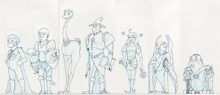
   In 2006 I set about to make a cast of characters for a story about morals and values. Each character, with the exception of the fellow in the long coat and tall hat, was named after a specific value and that character would exemplify it through words and actions. 

Here also the task was to create a Cast and to show how the characters related to each other in a set. Up to this point I had largely focused on the single character, but had never had them line up. Often this development can lead to major changes if they don't work well together.


    The pieces were drawn on several pieces of 8.5x11 inch paper and taped together. The tallest toon being about 10 inches or so, the work appears rough and stiff.
                                                                    The Cast
                                                   
     In this image, was my first foray into using digital to color a piece. It was scanned into Illustrator and kept simple. Were I to do this one again, I would make sure the lineweight was more varied, but we all have to start at the beginning.

   I never wrote the story. The lessons learned were enough for me to continue on with other project ideas. Perhaps, that's not the best way to do things. Finishing work, even poor work is better than not seeing it through, at least at the beginning of an artist's journey.

There will be time later to polish the art. The important thing is to just do the best you can.

  As I had been working on 3D training at the same time as my 2D work, it was also a period I began doing concept drawing for the purposes of 3D modelling. So the idea is to draw a front and side view of a character that lines up along specific points, such as the eyes, nose, chin chest and so on. This one is not successful, but in my blog posting, I am showing the unsuccessful work along with the better stuff.


Heads are always the first thing that the viewer will focus on. So I do a lot of them. Will the viewer be able to respond to the character? Will it seem plausible and identifiable? Will the expressions of the toon, come out in the body language?
  And characters need other devices to help with that identity...Here a picture WW2 spitfire got a warp/morph/cut and paste  treatment in Photoshop, printed onto a new sheet and then redrawn using tracing paper. The character doesn't stop at the edge of the paper...one must also think of the world they live in and adjust accordingly....a good example of this is the animated film Planet 51 .


Other examples that were adjusted in Photoshop for easier viewing...forgive the poor scans please....

Chris
Enhanced by Zemanta

Thursday, September 20, 2012

2004-2005

  Not every year is a successful one.

  I think that it's important to talk about those times when life's requirements get in the way of creating Art.

  Before that discussion though, I'll post the few pieces I could find from these years.

                                                              The Rabbit Gladiator

     This character was drawn to about 14 inches tall. Quite large for me as I had for many years created work that was only about 4-8 inches tall. Working large, however, forces one to think a great deal more on spacial and line quality. Like most of my work though, this is slightly negated by the non-photo blue pencil.

Using soft color colored pencils allows one to stay loose with the sketch so that when the heavier linework comes, you can chase the shape, without sacrificing time to 'get it right'.

During the period of 2004-2005 I switched from pencil to ballpoint pen in my sketchbooks. The pen is unforgiving as it doesn't allow erasing. It takes me about 8 months on average to fill up a 6x6 sketchbook, drawing 1-3 inch roughs. This however is excellent training for learning to draw loose.

Even now in 2012, I don't erase the sketch layer and generally find myself less likely to erase a finished line. That's the difference between something that is raw and exciting vs. stiff and boring.

After you have filled a few sketchbooks. you'll also be faster...a trait that can only help getting finished work completed within the deadline.


  Also found were the original pencils from the Tatyana and Zink digitally painted work that was completed in  2012. here is an example of how a good idea can take a while to reach fruition. While I am prone to tossing out old sketchbooks and work that no longer satisfies, these stayed with me.

One thing on that tossing bit is that I feel strongly about the need to let things go to the wastebin, when we have either technically or mentally surpassed the work. I'm no hoarder and the weight of carrying a lot of paper can get a bit daunting. Also, as a commercial artist you will be expected to give up the child when the deadline is due. Best to start getting into that idea early on. Let it go and then let the world decide where the art fits in the grand scheme of things.

Chris

Monday, September 17, 2012

2003

    Working up to the Snoggle piece, I set about to create seven characters as a group. Their names would all start with the prefix "Sn". They were supposed to be a ragtag group of warriors out on the fringes of the explored world. They would never be in any battles as they had perfected how not to 'become involved in such nonsense', but never-the-less, the group would always be a laugh.


  Snoggle would begin like all the others, an idea and a head to go with it. The side torso sketch I did came in 20 minutes while talking on the phone. Let it not be said that the sub-conscience wanderings of the mind are invaluable to the artist! Little has changed on this character since that day. Whatever side I draw the head and feel most comfortable with, is traditionally the side I will first draw the body. Dynamic poses come much later. First, we must train our hand to draw what our mind sees.


  Snuggle, was supposed to be the female role model in the group. From her softer features to her Valkyrie helm, she exemplifies courage, honor and beauty. Mind you, these sketches were done a long time ago and I know they are quite raw, but it helps to have at least some story in order to be more successful at designing a toon.


 General Snokkum is a retired military tactician. He would be the guy who always assumes that he's the leader, but as the characters do their own thing, he really doesn't lead very much. In fact, he's more likely to spend his days talking about great campaigns of the past than actually doing anything useful.


Snout was the pompous and arrogant noble essentially 'slumming' it. He is always trying to impress Snuggle with his pedigree, but to no avail. He has the best armor, weapons, tent and gear, but he also will have another character to keep everything neat, clean and orderly.


  I don't think I ever gave this fellow a name, but I know he was a hothead and always ready to charge head first into trouble. He also had a crush on Snuey, who comes next.


 I saw Snuey as a girl who was trendy to the point of being impractical...I mean who wears fishnets and mini skirts out into the jungle? For her, anything short of 'fun' would be lame.


  One thing that was always evident was that the group never had enough to eat, but their Chef Snowball, was always happy and full.

 I've written several pages of storyline on these guys, but what happens when the idea's don't come anymore? They call this writer's block. I think that choosing if you are going to be an artist, means giving up time to developing any detailed story. An artist should be able to describe in a few sentences what his idea is about, but beyond that...you can leave the writing to those who chose that path and spend more time at the drawing table. It takes a certain creative force to be able to handle both tasks without sacrificing the quality in either.

Chris

Sunday, September 16, 2012

2001-2002...Final Thoughts

  In the summer of 2001, I was able to attend the School of Visual Arts on a scholarship. It payed for two courses. One was on Realistic Painting, the other on Character Development with Stanley Martucci. It was a fun time, going into the city, feeling the artistic vibe of the place, working for 4-5 hours, meeting great people and coming home late at night on the train.

We did 4 or 5 pieces as I recall, this one being all I have left from that time.

Upon my return to WCSU in the fall of that year, I focused on finishing designs. Up to this point I had just been working on heads and bits and pieces, but really hadn't worked on tying it all together.

This was also when Abe introduced me to the concept of "What's the Big Idea?".

Essentially what he meant is that at the end of all your work, what direction will you go in? Will you take someone else's idea and develop it further? Or will you create your own project, with no boundary's or limitations?

I was just starting to get interested in animation, so I proceeded to take a dragon's head from my sketchbook and draw a animators concept sheet in three views.


This character known as Soot, became the basis for an elderly dragon that no longer had the ability to breathe fire. The idea was to show a character that had grown well beyond the years of usefulness. Perhaps even lament on those years or be sorrowful for past wrongs.

The drawings line up Ok, but I've never tried to model this toon and it was the first time I had drawn wings.

In my final days at college, we had a Senior Portfolio show. One of the things I spoke to Abe about was not putting in any student work, only original pieces meant for the show.

And here's where I step on my soapbox again.

Student work does not belong in a portfolio.

Before you start yelling at me for such an insensitive comment, hear me out.

One day, you wake up and decide, "I want to be an artist."

That's great, but you'll have to learn all the rules of art and you'll have to practice....a lot. You'll be given assignments in school with deadlines...simulating, but not substituting, what you might encounter out in the real world.

So you have a 16 week class, you will work on 15-30 pieces for that class and at the end, remark how improved your work is after a short amount of time. Your grade will reflect "A" level work, your friends, teacher's and parent's, will tell you how great you are...

But it is still 'student' work....which can always be improved.

As far as the sheer number of pieces, imagine this idea by Malcolm Gladwell who theroized that it takes 10,000 hours to master a skill.

 So you have 5 (5hrs total)  art classes a week (very difficult actually) for four semesters (over two years) and you have spent a  combined maximum effort of 1600 hours in an art class environment. We know however that you are not making art during that entire time. There are lectures, individual meetings, critiques and general chatting with fellow students.

In short you'll have a way's to go before being able to Master the medium. And that's of course if you generally stick to only a few methods, instead of skipping around..trying different approaches.

Does that mean you won't be able to get paid work when you graduate? Nope.

You should have the necessary skills to get an art job done at this point, but in going back to the beginning of this discussion....a portfolio should show the maturity and work of what you have learned through original ideas and pieces.

And when I say original ideas...I mean the influence of your surroundings being used to create a response in the form of Art.

These pieces were original or responses...

  This was an illustration using a Todd McFarland Spawn toy. It was a motorcycle, but I didn't like the wheels, so I illustrated it as a jet bike. I can't claim the original idea, but the drawing is original, because I 'observed' it and 'drew what I saw'. It therefore becomes a basis for skill level and not much more.

In this piece, I wanted to see how I was doing in improvement. The original b&W sketch was done while in the Navy, during the 80's. My method back then was largely 'trial and error'. Essentially I would draw/erase/and redraw until I was happy with the result. \

Later we will talk about how this method is replaced by multiple lines.

The blueline work is where I am revisiting an old piece, with my new found knowledge in art creating, using everything from control of the medium to advanced figure drawing to presentation.

And finally, detail and color. This one done in color pencil. I researched sundials for a composition involving the birth of dragons. Though the final piece was never finished (you'll have a lot of those), the intricacies and reference used on this one, still shows confidence and a solid understanding of light, warms and cools.

Revisiting successful old pieces, will give you greater clarity and direction on future work. You may even redo a piece or use it for reference on some future work.

 Try not to hold on to every scrap of paper though, it's also a lesson to be able to 'let go' of that which no longer satisfies the creative soul.

Chris


2001-2002 Continued...

   During this time, I was also developing Snoggle and friends. As I had said earlier, the original idea came from a blurred picture I had taken in DC in 1998. An artist tends to create a great deal of reference from many different sources. This might include photographs that you take yourself, books, saving images from the internet or just simply taking the sketchbook outside and drawing what you see.


  They were quite 'raw' back in the day. One however, went on to be Snoggle. You'll also notice that the linework is confident, but still in need of maturity. The beginning of my 'style', or more specifically, the method I feel most comfortable using when creating, is only just starting to show itself.

  I should take a minute to discuss style. 

  Style is not looking at a favorite artist and doing what he (or she) does. That's copying. When an artist takes this approach, it immediately is recognized as amateurish. Your work could be excellent, but the execution in someone else's voice will be evident.

  And that's exactly what style is....your voice, shouting to the world.."This is my Work!".

  After a while (translation *years), the audience will see something you did and know that it was you that created it.

  Be prepared however, to wait a long time. The more effort one puts into the development of work, the shorter the wait.

Chris

2001-2002

   My efforts in the early days, while still in college, had me concentrating on line over shape. I suppose this is a natural way for a beginning illustrator to approach the work. This is a distinct difference between the painter and the illustrator...at least at the start.

  This was also a period of 'trying everything'. It would still be a couple of years before I settled on character design as my focus.

  My mentor, Abe Echevarria, asked me to come up with some designs for a logo. This logo would be used for the Graphics Research Group...essentially a loose-knit animation program. One of the key points is that he wanted to see something that had the same feeling as the animated broom in the Sorcerer's Apprentice.

 Thinking of the strands of the brook, I came up with these.


   I probably did a set of 6-8 ideas, but these were the ones I went on to ink. The design needed to have a feeling of motion, as in animated. Computer technology wasn't as advanced as it is now, so the limitations of resolution and printing also came into play. It had to be something that could easily be reproduced.

  We settled on the top two for the next step of color comp.

 As you can see, the wave worked much better into the confines of the overall layout. The scans on this blog are all that remain of the original file, hence the waviness in the picture, but you get the idea.

Chris